
Categories
- AngularJS Development
- Awards
- Business
- Content Marketing
- Digital Marketing
- Ecommerce Development
- Email Marketing
- Magento
- Microsoft 365
- Mobile App Development
- Mobile Optimization
- MongoDB
- Node.js
- Online Marketing
- Search Engine Optimization
- Shopify
- Social Media Marketing
- Web Development
- Website Design
- Website Maintenance
- WordPress Websites
Download Our Digital Marketing Ebook
Download Our Digital Marketing Ebook
Imagine this.
does-your-website-convince-or-confuseA potential customer, coffee in hand, finally clicks on your ad. They’re interested. They land on your homepage.
They look confused. They scan for a moment and quickly hit the back button.
Your potential customer is gone. Probably forever.
That entire marketing spend, that glimmer of interest, vanished in less time than it takes to read this sentence.
Situations like this happen every single day. The problem for many websites is the gap that exists between what you think your website is saying and what a new visitor actually understands in those first few crucial seconds after landing on your page.
It’s not about having an “ugly” website or even a brand-new one; some confusing websites look impressive, but still fail at getting their message through. What it’s really about is a lack of clarity. And it’s costing you.
What does it mean for your business? It means high bounce rates. Wasted ad spend. Lost leads who will likely never come back. It all adds up to a damaged first impression.
But what if you could find the exact point of confusion?
There’s a powerful tool for that, and it’s called the 5-Second Test. In this guide, we’ll not only show you how to use it, but we’ll also give you a step-by-step Blueprint to fix the problems it reveals.
By the end of this post, you’ll have a clear action plan. Let’s get started.
What is the 5-Second Test & Why Does It Matter?
Let’s be honest, people don’t read websites anymore. They scan them.
Your visitor’s brain is busy. It has a limited capacity for new information, a concept called “cognitive load.” If your site is complicated or unclear, it makes their brain work too hard.
And a confused mind almost always says “no.”
Visitors to your site will give you about five seconds to make your case. In that time, they aren’t studying your font choices or admiring your logo. They are on a mission to figure out if you can help them. Your homepage gets a glance, not an examination.
So, what is this magic test? It’s actually incredibly simple, and you don’t need any special tools or expensive subscriptions to do it.
The 5-Second Test is a quick check where you show someone your webpage for just five seconds. Then, you take it away and ask them a few simple questions to see what they really took away.
The Litmus Test Questions
Your website has to provide answers to five basic questions almost instantly. They are:
- 1. What does this company do? (The offering)
- 2. How will it make my life better? (The core benefit)
- 3. Who is this for? (The target audience)
- 4. What am I supposed to do next? (The call-to-action)
- 5. Why should I trust them? (The trust signal)
If a stranger can’t answer most of these after a 5-second glance, your website isn’t working as hard as it should be.
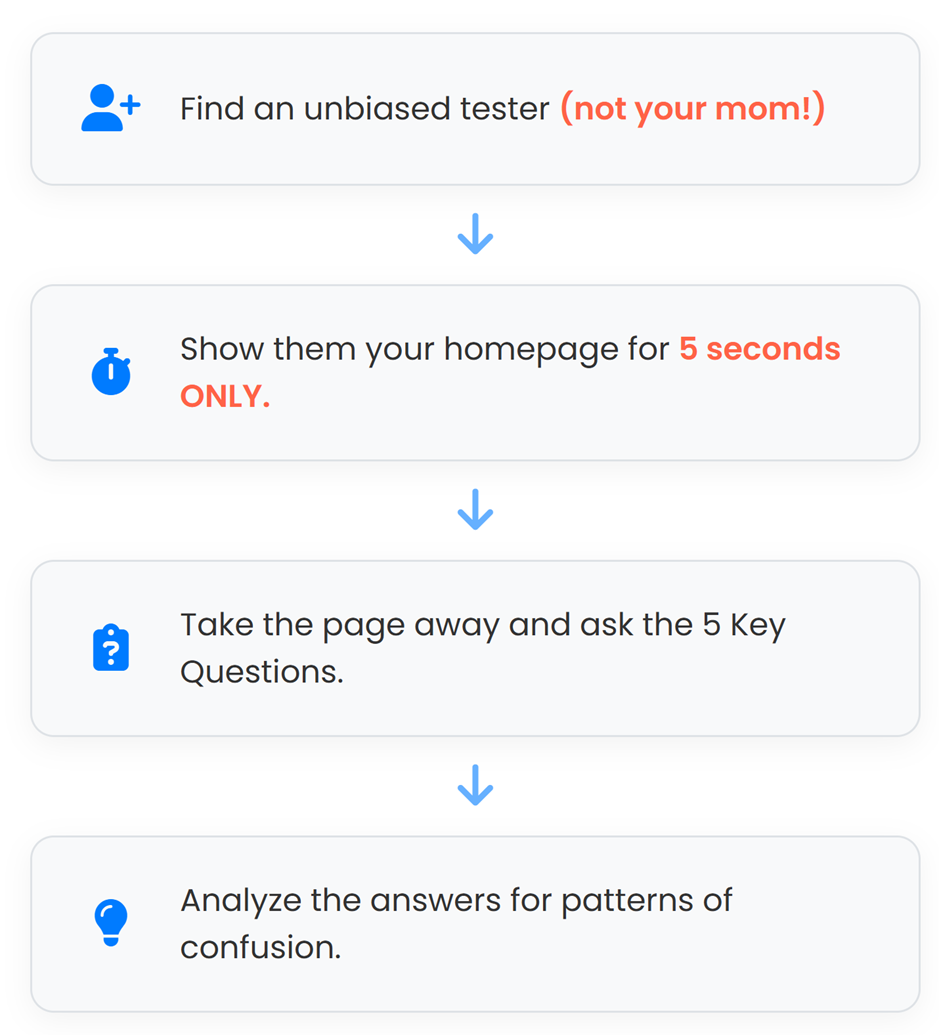
How to Run Your Own (Free) Test
You can do this right now, for free.
Step 1: Find Testers
Find 3-5 people who are not familiar with your business. Do not ask your team. Do not ask your spouse. And please, do not ask your mom (she’ll say it’s perfect no matter what). You need fresh, unbiased eyes. A great place to find people is to ask connections on LinkedIn who fit your ideal customer profile.
Step 2: The Method
Ready? Here’s what you do. Get on a quick video call and say: “I’m going to show you a webpage for just 5 seconds. I want your first impression.”
Open your homepage. Share your screen. Count to five out loud. Then, stop sharing your screen or close the tab. Now, ask them the five questions from the list above and write down their exact answers.
Step 3: Analyze
Review the answers. Are they consistent? Are they correct?
If 4 out of 5 people think your accounting software company sells office furniture, you don’t have a design problem — you have a clarity crisis. Look for patterns in the confusion. That’s your starting point.
3 Common Fails We See Every Day
Now that you know how to test, let’s look at the common failures this test reveals.
At Nirvana, we’ve audited hundreds of websites, and these are the most frequent offenders —the usual suspects behind a high bounce rate, if you will.
See if you recognize any of them.
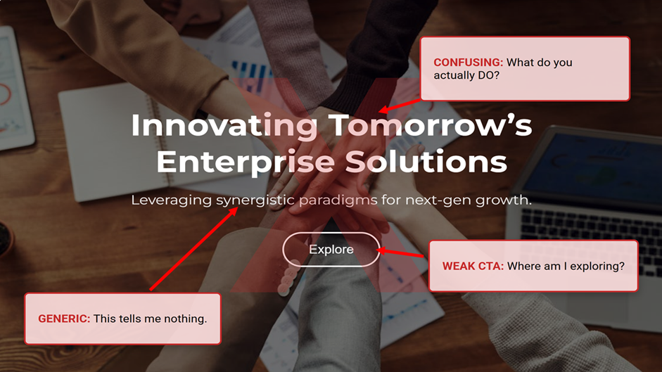
FAIL #1: The “Synergy & Solutions” Headline
You’ve seen these headlines before.
They are filled with big, impressive-sounding words that don’t actually say anything. Things like:
- 1. “Leveraging Synergistic Solutions”
- 2. “Innovating Future-Proof Paradigms”
- 3. “Enterprise-Level Value Propositions”
It’s corporate-speak. Businesses use it because they think it makes them sound important and innovative.
But all it really does is create a wall of confusion.
A new visitor doesn’t know what a “synergistic solution” is. They just want to know if you can fix their problem. When you make them try to decipher your headline, their brain checks out. Or worse, they think you’re all buzzwords and substance.
Remember, clarity is always better than trying to be clever. Always.
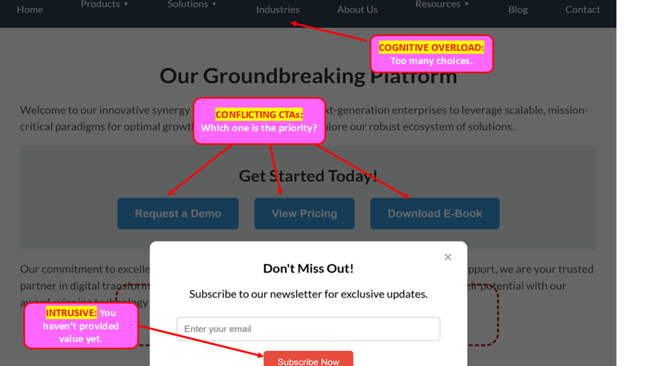
FAIL #2: Democracy of Buttons & Cluttered Design
This one is simple: when everything on your page is important, nothing is important.
We call this “The Democracy of Buttons.”
It’s when a homepage has too many things fighting for your attention. There’s a button to “Request a Demo,” right next to another button to “See Our Pricing,” and another one to “Read Our Blog.”
Then a pop-up appears asking you to subscribe to a newsletter.
The navigation menu has fifteen different options. It’s a visual traffic jam.
This overwhelms and paralyzes your visitor. They don’t know where to click, so they often choose the easiest option: the close button. Your job is to guide them to the next crucial step, not show them every single door in the building at once.
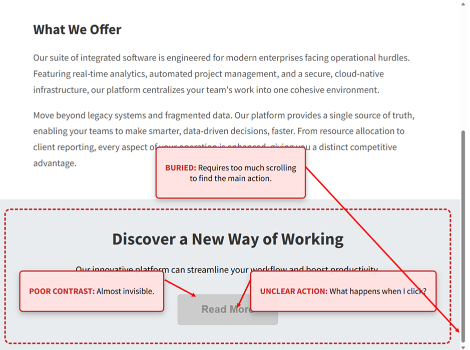
FAIL #3: CTA Buried like Hidden Treasure
This fail is incredibly frustrating because it means you did all the hard work of convincing someone to act, but then you hid the checkout counter.
If your main Call-to-Action or “CTA” is hidden like buried treasure, you’re leaving it up to your visitor to go on a hunt to find it, and guess what? Most people won’t.
Maybe the button is a light grey on a white background, making it nearly invisible. Or maybe it’s in minuscule font and tucked away in a corner.
Or maybe the only button to “Get a Quote” is way at the very bottom of the page, after mountains of text.
When it comes to conversions, you need to make the next step obvious and impossible to miss. Your CTA should be bright, clear, and easy to find without thinking. If your visitor is sold on your message but can’t find the button, the journey ends right there.
Stop Wasting Ad Spend & Build a Homepage That Converts
Okay, so you’ve found the points of confusion on your website. Now for the fun part: correcting them.
The good news is that fixing confusion doesn’t require a complete teardown of your site. You don’t need to start from scratch; you just need a blueprint.
Here are the must-have elements every high-converting homepage needs, from top to bottom. Think of these as your building blocks for clarity.
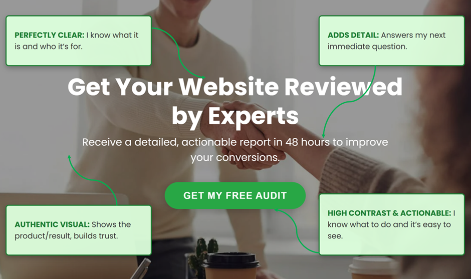
COMPONENT #1: Your Hero Section Is Your 5-Second Pitch
This is the big one. It’s the first thing everyone sees when they land on your site. This area has to do all the heavy lifting.
It must be perfectly clear.
Headline: Your headline is not the place to be clever. It’s the place to be clear. It needs to instantly tell people what you do and what’s in it for them.
Use this simple formula: [Verb-based Outcome] for [Specific Audience] with [Primary Offering].
For example, instead of “Synergistic Solutions,” you could say: “Get Comprehensive Website Audits for Your SaaS Company with Our Clarity Blueprint.”
See? It tells you the outcome (comprehensive audits), the audience (SaaS companies), and the offering (Clarity Blueprint).
Sub-headline: This is one powerful sentence that sits right under your main headline. Its job is to answer the visitor’s very next question or overcome their biggest doubt.
For example, if the headline is about website audits, the visitor might be thinking, “This sounds slow and complicated.”
Your subhead can instantly crush that fear: “We’ll deliver an actionable, jargon-free report in 48 hours.”
The Call-to-Action (CTA): This is your main button. Use action words that feel low-risk and focus on what the user gains.
“Get My Free Proposal” is much better than the robotic “Submit.” “Schedule Your Free Demo” is more inviting than the vague “Contact Us.”
Make it sound easy and make the button a bright, contrasting colour so no one can miss it.
Visuals: Please, no more generic stock photos of smiling people in boardrooms.
Use an authentic photo of your product in action. Show a video of your service delivering results. Use a picture of your actual team. Real images build real trust.
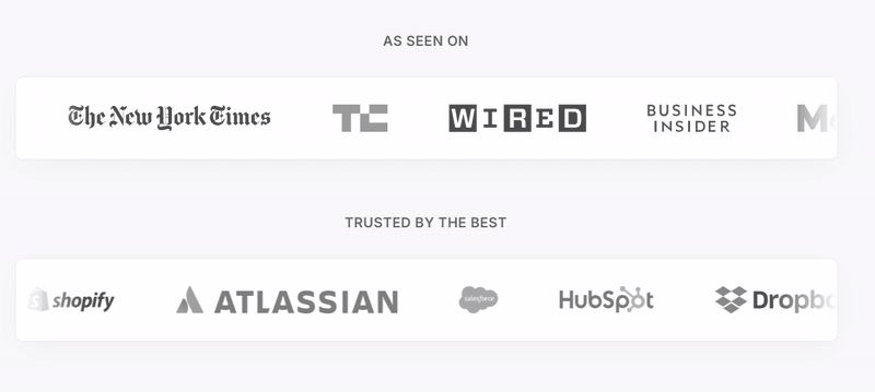
COMPONENT #2: Showcasing Proof and Credibility
New visitors are naturally skeptical. You need to show them they’re in a safe place.
Right below your hero section, add a simple “trust bar.” This is a small section where you showcase social proof. Simply put, it’s a space to demonstrate to your audience that other important people or companies trust you, so they can do the same.
This can be:
- 1. Logos of well-known clients you’ve worked with.
- 2. “As seen on” logos from media outlets that have featured you.
- 3. Industry awards you’ve won.
A star rating from a popular review site (like Google or Capterra).
This instantly lowers their guard and makes them more open to your message.
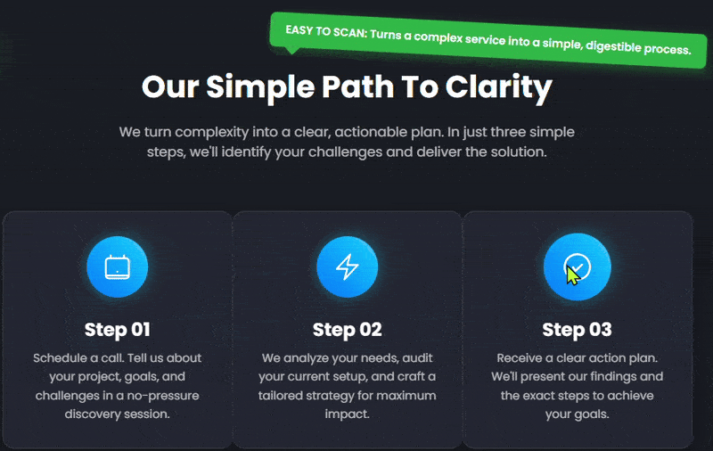
COMPONENT #3: Making the Complex Simple with 1-2-3 Process
If your service has multiple steps, it can feel complicated to a new customer.
The trick is to not make them think so hard. People crave simplicity.
Break your process down into three simple, bite-sized steps. Use an icon for each step and keep the text super short. Focus on the benefit.
For example:
- 1. Schedule a Call. (Easy first step)
- 2. We Analyze Your Site. (We do the work)
- 3. Get Your Action Plan. (You get the value)
This turns something that feels complex into a clear, easy-to-follow path.
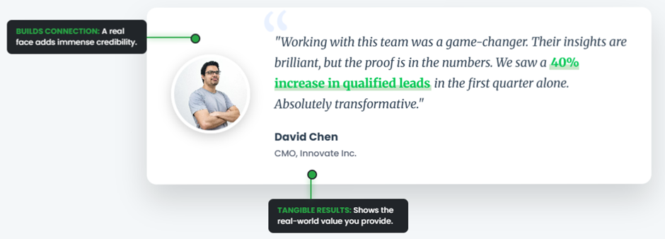
COMPONENT #4: Proof from the People You’ve Helped
When you talk about your services, don’t just list what they are. Frame them as solutions to your customer’s biggest problems.
But explaining your solution is only half the battle. You need to pair it with your secret weapon: customer testimonials.
And for added sauce, include a headshot of the reviewer along with their testimonial. A quote without a photo can feel sterile and make people question the authenticity. However, a quote with a smiling face next to it feels like a story from a real person. It builds an emotional connection.
The best testimonials also mention a specific, tangible result. “They increased our leads by 40%” is a thousand times more powerful than “They are a great company.”
From Confused to Convinced
So, what’s the one big takeaway from all of this?
It’s that clarity wins. Every single time.
Your website’s primary goal is to be instantly understood by anyone landing on your homepage. Before you spend another dollar on ads or marketing, run the 5-second test —it’s the most honest feedback you’ll ever receive.
You’re no longer guessing what’s wrong. You now have the blueprint to identify the real problems and the building blocks to create a homepage that really works to convert.
But you don’t have to do it alone.
If you ran the test and the results were underwhelming, don’t worry. This is what we do. At Nirvana Canada, we transform confusing websites into high-converting clarity machines.
Schedule your Homepage Clarity Audit today, and we’ll show you exactly where your opportunities are hiding.