Categories
- AngularJS Development
- Awards
- Business
- Content Marketing
- Digital Marketing
- Ecommerce Development
- Email Marketing
- Magento
- Microsoft 365
- Mobile App Development
- Mobile Optimization
- MongoDB
- Node.js
- Online Marketing
- Search Engine Optimization
- Shopify
- Social Media Marketing
- Web Development
- Website Design
- Website Maintenance
- WordPress Websites
Download Our Digital Marketing Ebook
Download Our Digital Marketing Ebook
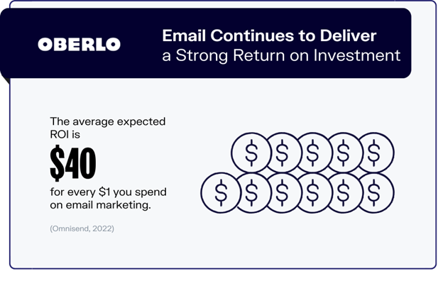
Some trends come and go, but when it comes to digital marketing, email marketing is just as relevant – if not more so – today as it’s ever been. Tried, tested, and proven effective email marketing remains unmatched in its ability to personally engage your target audience. As a recent Omnisend survey reports, email marketing continues to generate top ROI, averaging $40 per dollar spent. If you weren’t convinced that email marketing needed to be a part of your digital strategy before, that figure should be enough to get you on board.
Oberlo
However, with great popularity comes great competition. More than 80% of marketers rely on email marketing to share their messages and the open rate of marketing and promotional email messages stands at roughly 17%. While this is not terrible, it is clear that more than simply sending out an email marketing campaign is needed to guarantee the desired results. You need something more.
This blog will cover simple yet highly effective tips to boost your read rate and increase email marketing conversions.
Don’t Get Left on Unread
The average person receives 40 non-work-related emails per day. That’s 280 emails per week or nearly 1,400 per month. So, what makes some email content more compelling, and how can you boost your email open rate?
The trick to getting more people to open your emails is immediately offering them something that piques their interest. An attention-grabbing subject line is the icing on your marketing cake and it needs to be short and sweet enough to fit in under 50 characters but enticing enough to leave readers wanting more.
Here are five simple strategies you can easily use to help your email subject lines generate a little more excitement than “[Business Name] Generic Monthly Newsletter.”

Dont-Get-Left-on-Unread
Hook, Line, and Reel Them In
Don’t just announce, spark some curiosity with your subject line. Skip the generic “newsletter” or “update” and go for something more specific and intriguing. Lines like “Run, don’t walk, these styles are going fast
” or “You’ve just been offered a MAJOR discount (no joke!)”.
Say My Name
Boost that personal touch! Personalized subject lines make your emails feel like a one-on-one chat and they can increase your open rates by as much as 26% while cutting down on bounces. Toss the recipient’s name into the subject line, like “Hey Adam, we’ve missed you! Where have you been?” or “Does Fido have enough food?” and watch your open rate jump.
Lighten Up a Little
Keep it light and keep it fun! A cleverly humorous subject line can make your email stand out in a crowded inbox; just make sure not to go overboard with it. For instance, “C’mon, it’s Friday, and You’re Just Killing Time Anyway!” is simple, comical, and likely to resonate with audiences without coming across as offensive or unprofessional.
Go Big or Go Home
Big news, big subject line! Got something exciting to share? Let your subject line shout it out. Whether it’s a new product or a hiring spree, make it bold and exciting. “Just for you – VIP access to our new launch!” or “Drumroll please… We’re hiring!” are attention-grabbing examples.
Bring the WOW Factor
Ready for a shocker? Craft a subject line that leaves recipients wide-eyed. Just make sure the content lives up to the hype! Try a line like “OMG, You May Need to Lie Down for This” or “Kate, This NEVER Happens!” It piques interest and gets readers wondering what’s going on.
Wait, We’re Not Done!
As you play around with the length and style of your subject lines, remember not to overlook the often-neglected pre-header. This summary text comes right after your (the sender’s) name and subject line and is immediately visible to your recipients checking their inboxes.
The pre-header supports the content in your subject line and reinforces the call to action communicated within the email. Just like the subject line, it’s best to keep it concise and to the point.
Think of the subject line and pre-header as a dynamic duo; they must complement each other seamlessly and flow naturally to work cohesively as an engaging email introduction.
Call-Out with Catchy CTAs
Now that we’ve gotten readers to open your email, we’re ready to work on the core of your content. Keeping with our previous euphemism, if the subject line was the email icing, we are now mixing ingredients to make the perfect cake.
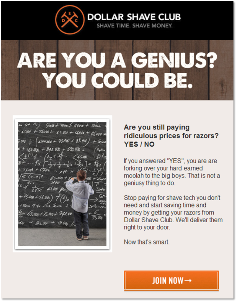
The ultimate aim of your marketing emails is to inspire action, and a compelling call to action (CTA) can be crucial in providing the necessary push over the-fence readers need. In a typical marketing email, this usually manifests as a simple, easy-to-spot, clickable CTA button that communicates what you are trying to get readers to do.
Call-Out-with-Catchy-CTAs
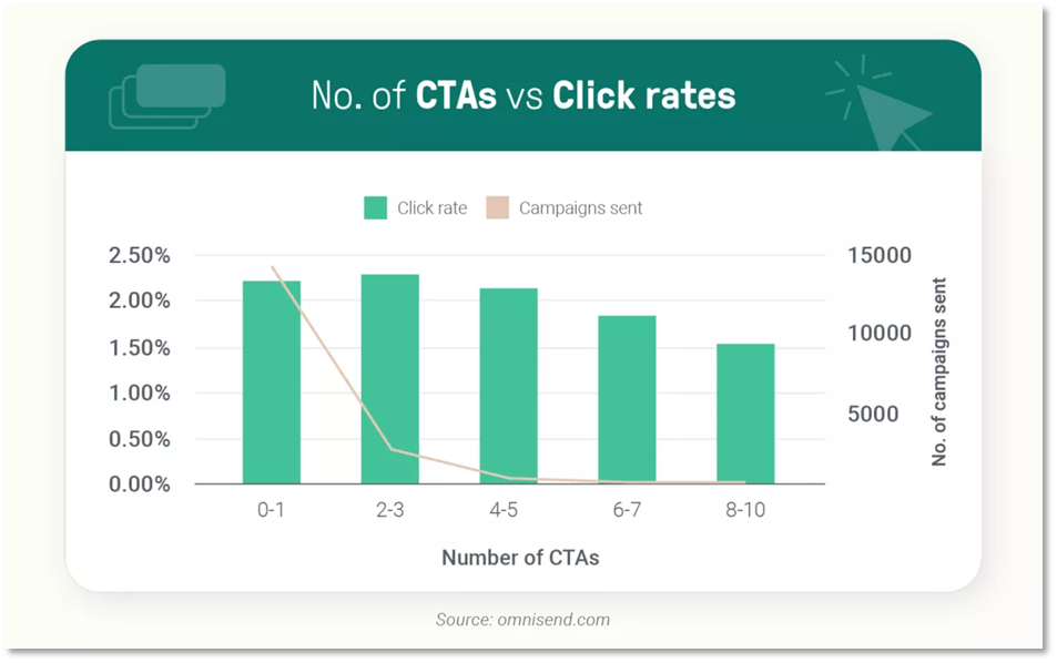
In some cases, your email may contain multiple CTAs. For example, you may have a “Shop Now with 10% Off ” CTA followed by CTAs to shop individual product categories. Just make sure to disperse your CTAs throughout the message, aligning their locations with the natural progression of the content. Placing them near the bottom of each section helps guide readers and encourages clicks through strategically selected landing pages. And finally, don’t try to cram too much into one email. Research shows that click rates decline after 3 CTAs.
Call-Out-with-Catchy-CTAs
Eye on the Prize
Creating a clear visual hierarchy is fundamental to effective email design. The principle here is straightforward: showcase the most important information first. This approach acknowledges the fact that most readers have limited attention spans, and many will not move beyond the first sentence or two, so getting your message across quickly is crucial.
According to science, the following layout options are best for enhancing focus and comprehension:
• Z Pattern: Best suited for emails with minimal text, the Z pattern mirrors the natural reading route of the human eye. It incorporates a zig-zag of content, starting from the upper left corner and moving right, down diagonally, and then to the right again.
• F Pattern: Drawing insights from eye-tracking technology, the F pattern relies on the upper left corner as the starting point. Readers typically scan the upper portion of the email, forming the top line of the F, then proceed to scan down and across. The further into the email they go, the more time is spent viewing the far-left side.
• Inverted Pyramid: Ideal for information-heavy content, the inverted pyramid places the most crucial details at the top, followed by less fundamental text near the bottom. This time-tested strategy has been a staple in mass media and remains a reliable solution for modern email campaigns.
Yes, We’re Going to Talk About Mobile Responsiveness Again
You’re probably tired of hearing it, but here it goes: if you want to win conversions, your content layout must consider that more people will view your emails on a mobile device or tablet than on a computer. Every email must adapt seamlessly to the viewing environment. In a mobile-first world, this means adjusting layouts to accommodate smaller screens by focusing on avoiding horizontal scrolling and attempting to minimize vertical scrolling.
Size Matters
Modern email layouts rely heavily on scaling, particularly in a mobile-first context. The principle is clear: larger elements attract attention, especially when contrasted against smaller features. However, striking the right balance is vital because scaling up too many elements will dilute their overall impact.
If you’re not sure where to start with template size, a good rule of thumb is to aim for a width of around 600 pixels and a height of 1,500 pixels, give or take, trying to keep individual content blocks under 1,000 pixels. Headers and footers offer more flexibility depending on the size of images or the amount of text you plan to include.
Play with Colour
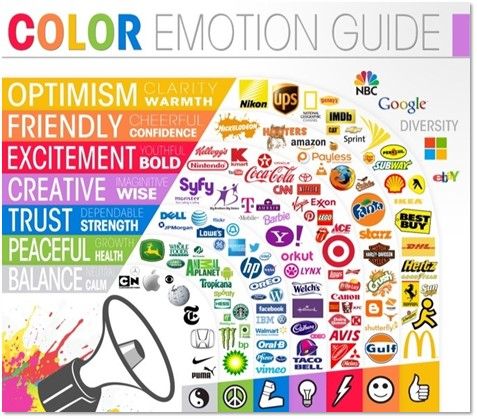
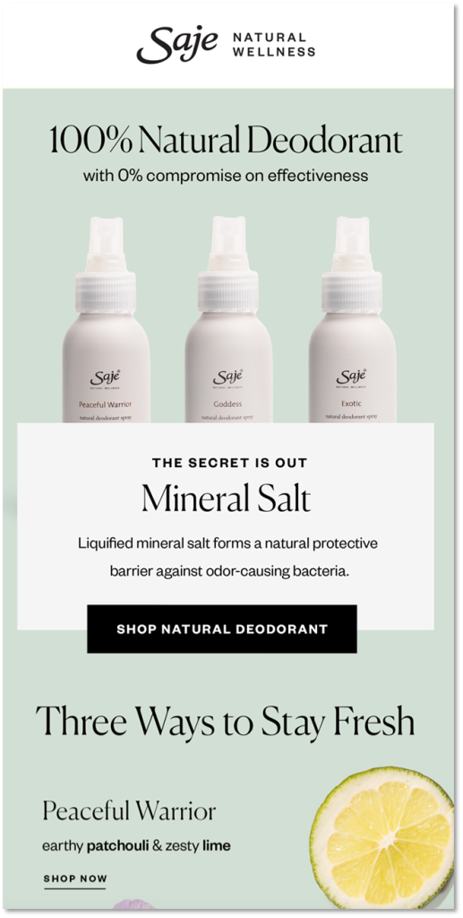
Colour is a crucial component in every aspect of your email design. From background and text to images, your choice of colour helps connect readers with your brand and plays on their emotions. The proper use of colour, or even lack thereof by leveraging blank space, helps convey very different messages and, when used effectively, serves as a tool to draw attention to specific areas you want to emphasize, such as using bright colours for call-to-action (CTA) buttons.
While bold colours can grab attention, use them judiciously to prevent clutter. In minimalist designs, white space may dominate while a single bright colour can direct focus to a specific header or image. Consistency should also play into your colour choices as using consistent colouring across various channels such as social media updates and blog posts, contributes to brand recognition. However, there’s room for experimentation, especially during holidays where colours reflecting special occasions can add a celebratory touch.
Play-with-Colour
Don’t Forget About Font
Even with spot-on sizing, colours, and layout, your emails may feel cluttered or impersonal if they feature the wrong typeface(s). There’s no one-size-fits-all solution for typefaces as the right choice should align with your brand while not distracting from your message.
Opt for reader-friendly and visually correct fonts—email-safe fonts that enhance your brand’s tone and intent. With people spending less than 12 seconds on average on an email, typography is a vital design element. Serif (like Times New Roman) and sans-serif (like Arial) are the primary font styles, each with its characteristics. If you don’t know where to start in a sea of over 200 options, the ten safest, most email-friendly fonts are:
• Arial
• Helvetica
• Times New Roman
• Georgia
• Tahoma
• Verdana
• Courier New
• Palatino
• Futura
• Calibri
Font size matters, too. Try to stay between 10 and 16 points. It’s also important to note that well-designed emails often incorporate more than one typeface, using them strategically to draw attention to specific parts of the message. If you are going to play with multiple fonts then consider using one font for headers and another for more substantial text.
Finally, before getting too enthusiastic about a unique typeface, ensure it is web-safe to display consistently across various email clients (for example, Outlook and Google) and make sure the font(s) you choose can be easily read on mobile devices.
Play-with-Colour
Balance Images and Text
Images add instant visual interest to your emails breaking up blocks of text and making the content more engaging. They present an opportunity to make emails feel more relevant or personable especially when featuring compelling products or services. However, it’s crucial to balance images with text; too many images will bog down your email and may trigger spam filters while too much text can overwhelm readers.
Each image should serve a clear purpose beyond merely breaking up content; it should reinforce the information presented in the text. Quality is also paramount as users are accustomed to and expect high-quality visuals. Opt for one or two excellent photos rather than numerous lacklustre images and use them strategically to deliver the greatest impact possible for each visual display.
Wrapping Up
In a sea of digital messages, quantity is not the answer. It’s the little things that can help you get noticed. By crafting attention-grabbing subject lines, compelling CTAs, a visually appealing layout, and striking the right balance between images and copy, you can help ensure your messages not only get opened but also drive meaningful engagement. Ready to boost clicks and conversions? We can help you implement these strategies now, and you can watch your email marketing game soar to new heights.

